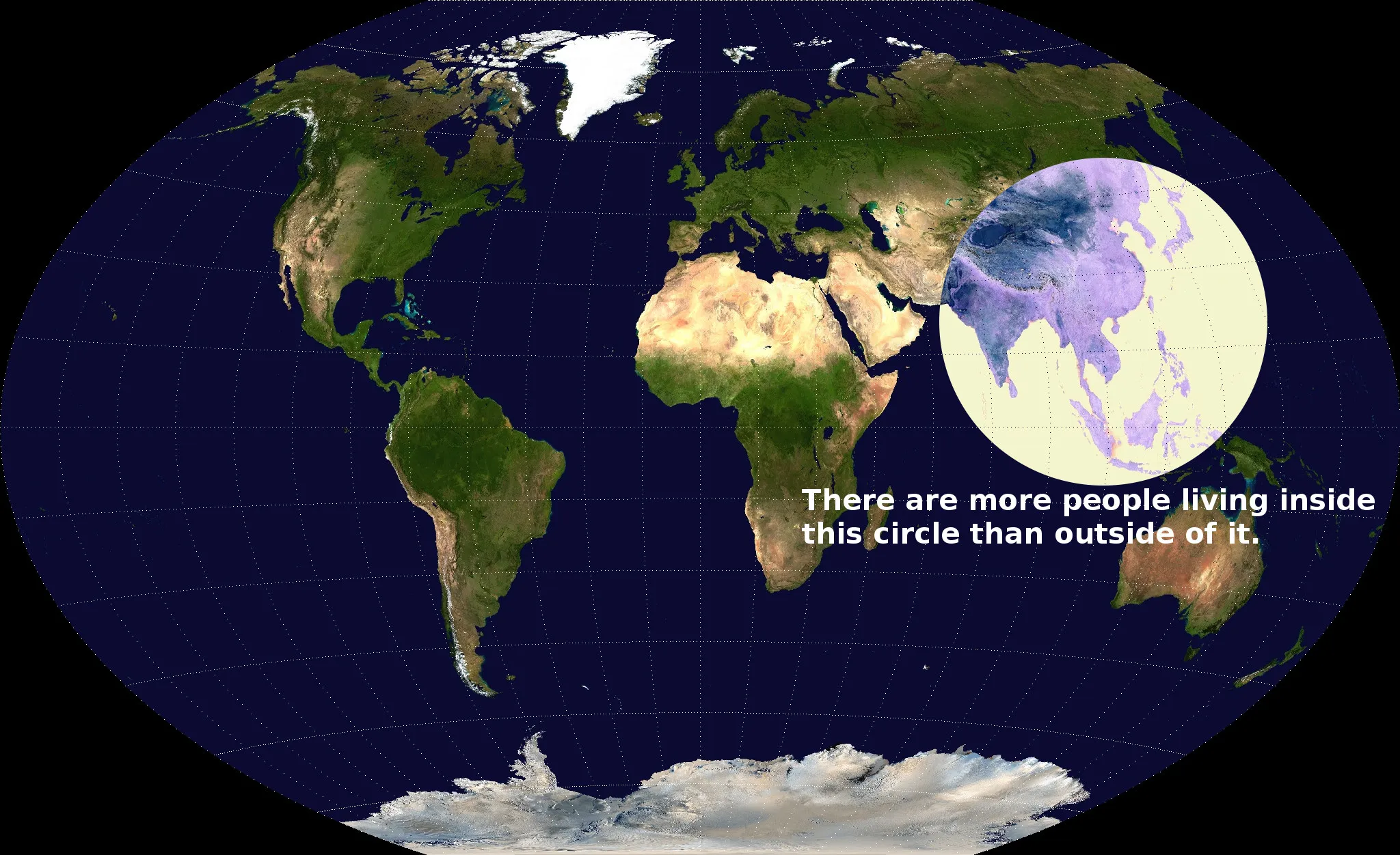
Map-enthusiast Valerie Pieris has created a fascinating visualization of human population centers. We all know that a huge fraction of humanity lives in Asia, but this map really drives the point home. There are more people in China, India and Southeast Asia than there are in Europe, North America, South America and Australia combined. Yet another fun fact brought to you by the Anthropocene.
Via Reddit.
Picked Articles ...
Loading stories...

Comments (0)
Share your thoughts and join the technology debate!
No comments yet
Be the first to share your thoughts!