How People spend their Day
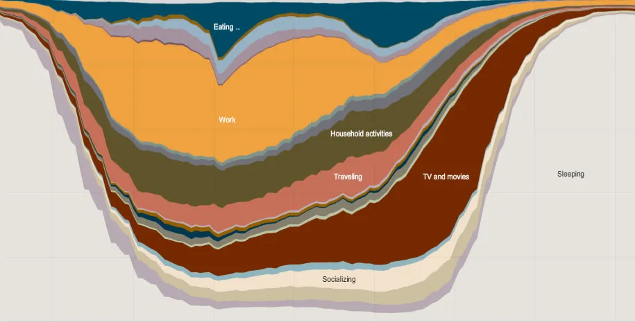
Koert van MensvoortNo, you aren't looking at a graph of the Earths geological layers. The layers in this visualization represent an average of how thousands of Americans spent their day.
The data was collected by the American Time Use Survey, which NY Times translated into this interactive map that allows you to see the differences between various groups like employed, unemployed, men, women, Black, White and Hispanic.
Would be fascinating to compare the graph with a day in the life of a caveman – the hunting & gathering type. Surely there would be less time watching TV & movies back then, but how about household activities? Traveling and Socializing? We wonder how the border between work and leisure worked for them and whether they were active during the same 'office hours'.
Related: Time pilots us, Office Rebellion, Supermarket – our next savanna.
Comments (0)
Share your thoughts and join the technology debate!
No comments yet
Be the first to share your thoughts!