The world according to data
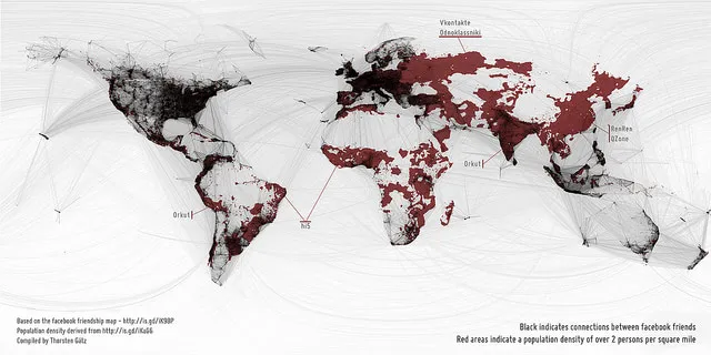
Rolf CoppensA map of the world, drawn in two layers: the red for population density (over 2 persons per square mile) and the black overlay for connections between Facebook friends. Made by Thorsten Gätz, bigger version can be found here. Via Martin.
Picked Articles ...
Loading stories...
Comments (0)
Share your thoughts and join the technology debate!
No comments yet
Be the first to share your thoughts!