Where the Other Half Lives
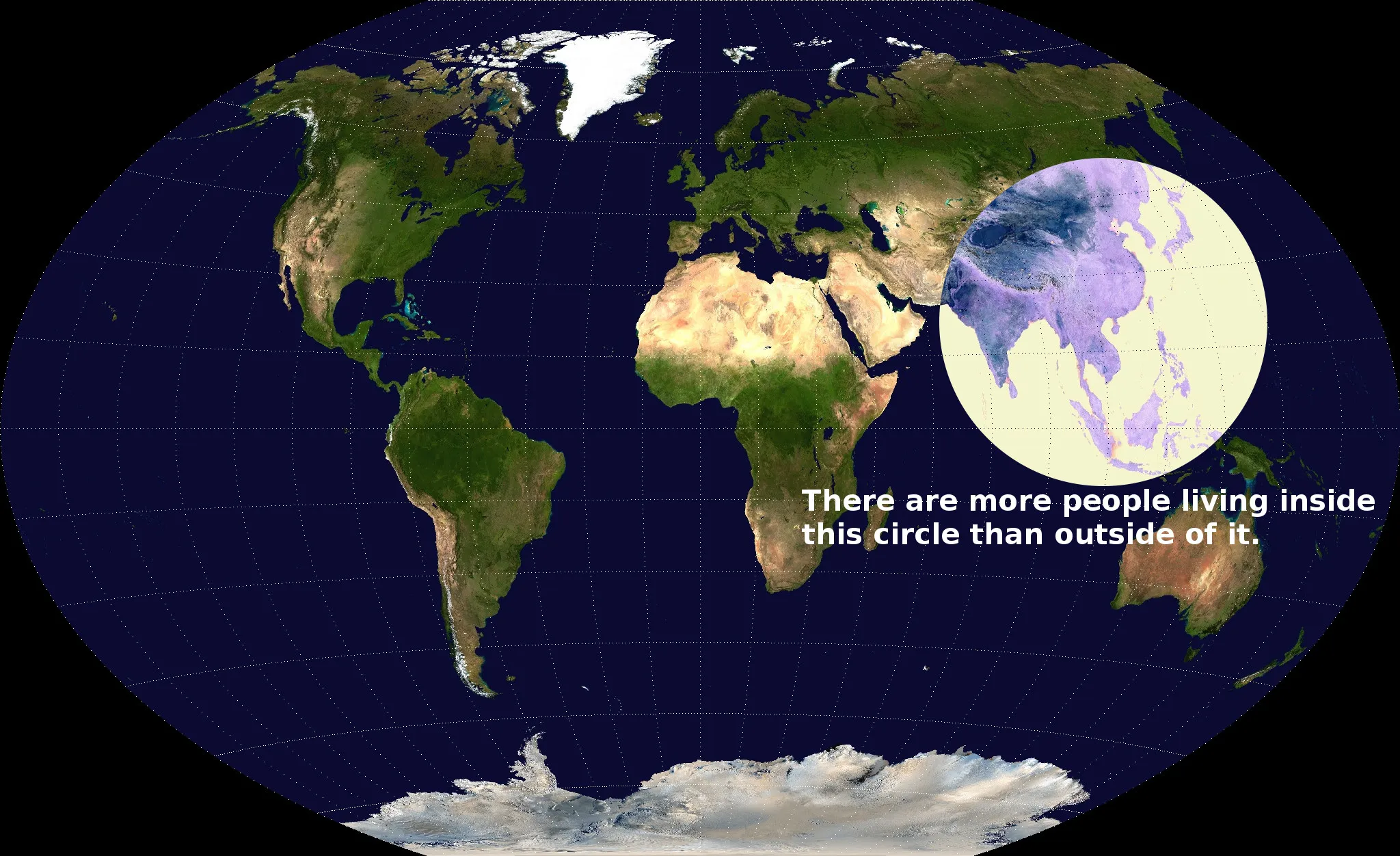
Allison GuyKaartenliefhebber Valerie Pieris heeft een fascinerende visualisatie gemaakt van menselijke bevolkingscentra. We weten allemaal dat een groot deel van de mensheid in Azië woont, maar deze kaart brengt het punt echt goed over. Er wonen meer mensen in China, India en Zuidoost-Azië dan in Europa, Noord-Amerika, Zuid-Amerika en Australië samen. Nog een leuk weetje, gebracht aan u door het Antropoceen.
Via Reddit.

Picked Articles ...
Loading stories...
Comments (0)
Share your thoughts and join the technology debate!
No comments yet
Be the first to share your thoughts!