The world according to data
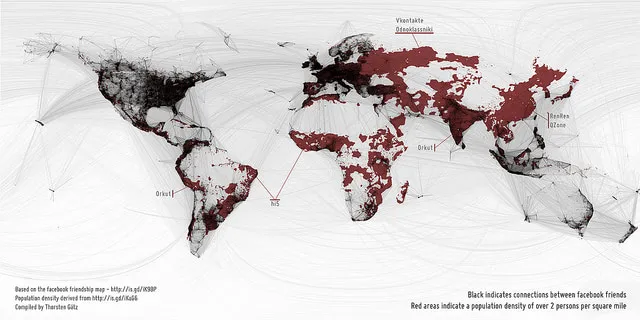
Rolf CoppensEen kaart van de wereld, getekend in twee lagen: de rode voor bevolkingsdichtheid (meer dan 2 personen per vierkante mijl) en de zwarte overlay voor verbindingen tussen Facebook-vrienden. Gemaakt door Thorsten Gätz, een grotere versie is hier te vinden. Via Martin.

Picked Articles ...
Loading stories...
Comments (0)
Share your thoughts and join the technology debate!
No comments yet
Be the first to share your thoughts!